Learning from Board Game Design
Last year I bought a copy of Scythe from publisher Stonemaier Games, based in large part on the art. I was very happy with the art and enjoy playing the game, but what I found even more satisfying was the design of the rulebook, the iconography, and the use of physical tokens to re-inforce processes used throughout the game. This week I bought Wingspan from the same publisher, again based in large part on the artwork, and once again I’m finding the other aspects even more satisfying.
While most of the enjoyment of playing a game comes from the core rules and much of the rest comes from the visual design, it’s these details that tie it all together for me, making what would otherwise be a collection of rules into a coherent system that is intuitive and fluid to play. I’ve not played a lot of board games and I have seen some of these aspects in others, but for games beyond the complexity of Carcassonne for example, I have so far found Scythe and Wingspan to feature some of the best design.
Simple rulebooks
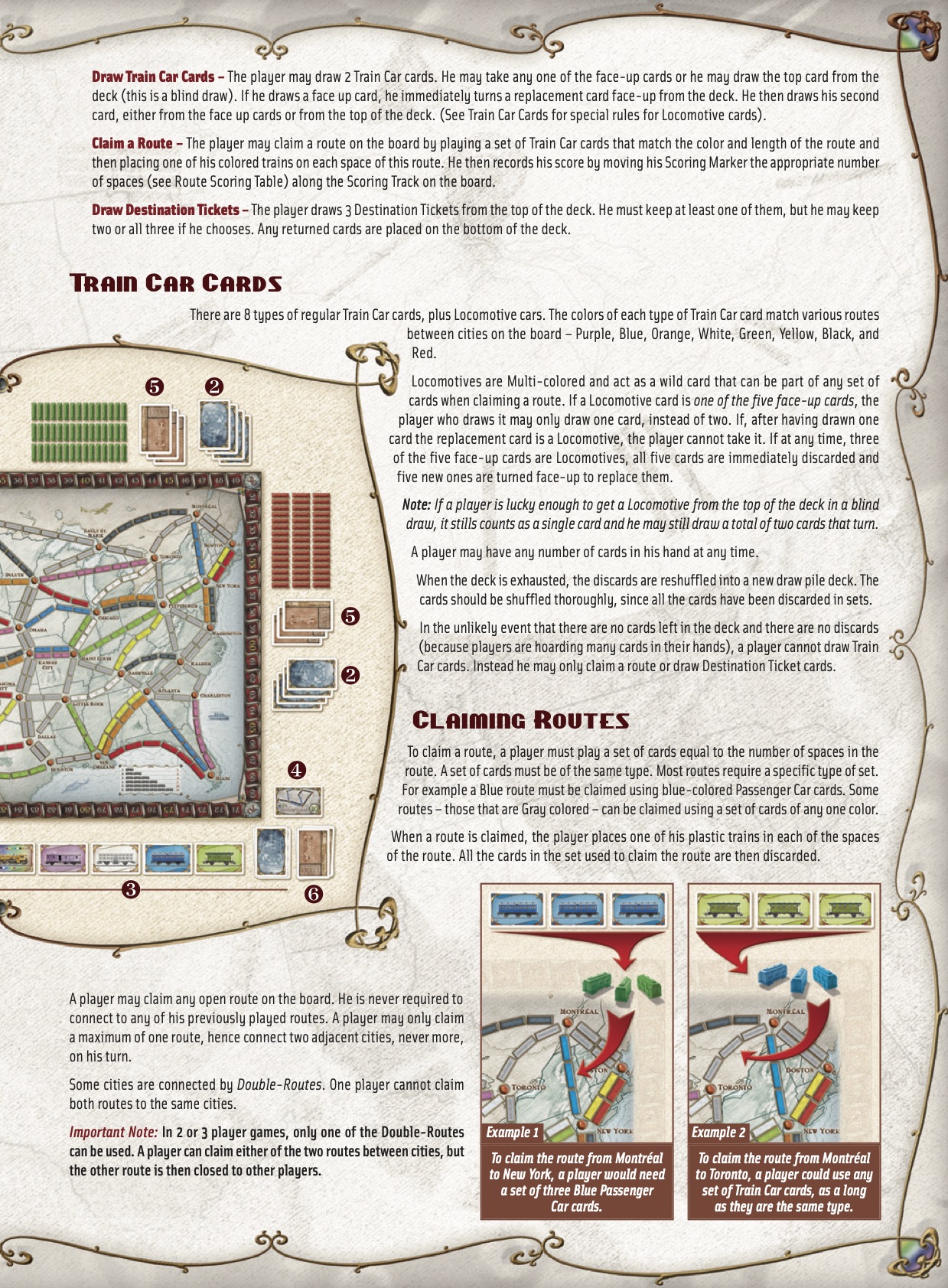
Let’s start with the most straightforward design aspect, the design of the rulebook. Wingspan is a solid example of how a good rulebook can make a game easier to understand, so let’s take a look at this page…
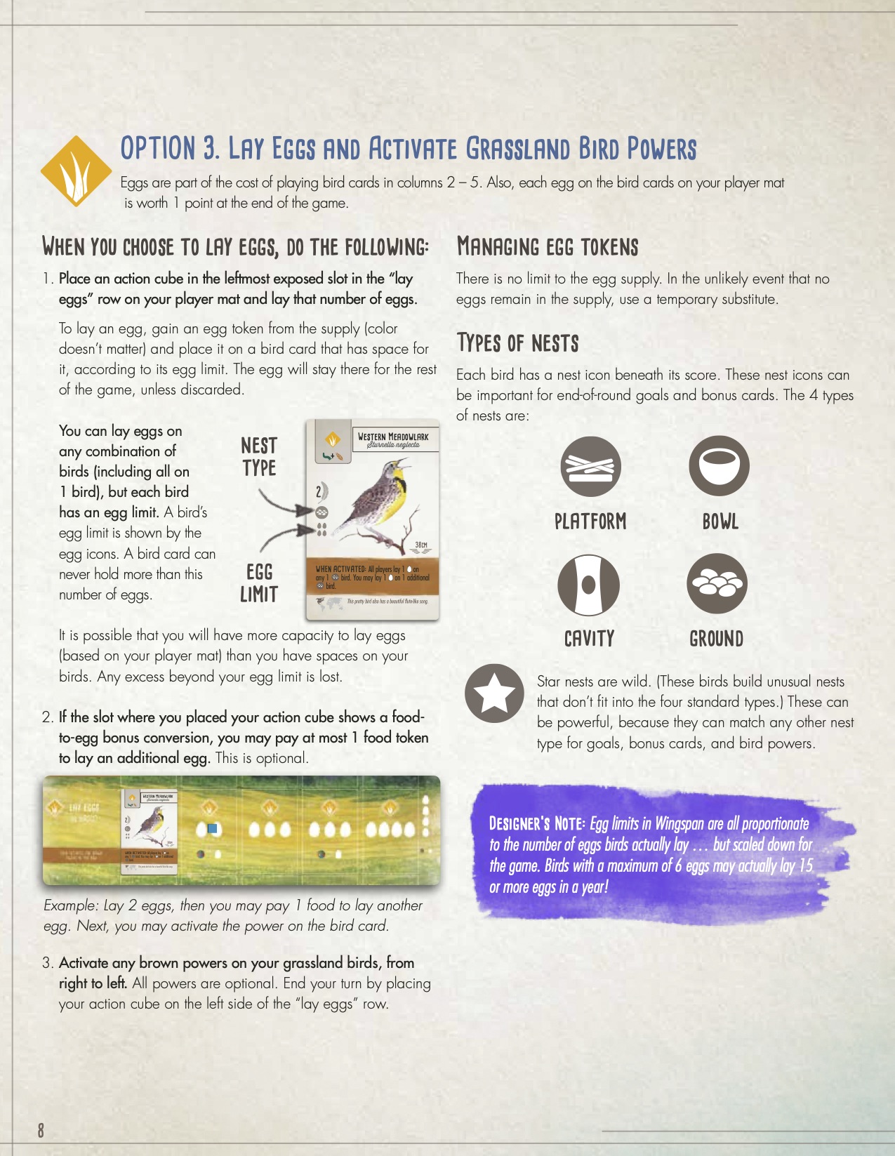
First off this page looks great and has plenty of whitespace. It’s easy to scan and hard to lose yourself in. The title structure is also clear with a section title and subtitles clearly readable.
In comparison, this page from Ticket to Ride is much more dense. It uses titles to add some structure, but it’s hard to know what’s important in those long paragraphs. Processes aren’t clearly separated from rules and the diagrams are very general.
The key to Wingspan’s rulebook is the progressive information disclosure. Take this example…
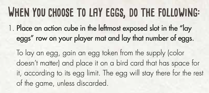
- The title makes it clear that this is a process.
- The bold text describes what to do in basic terms – but not in too much detail as this is “Option 3” so we’re already familiar with the rough mechanics.
- The regular weight text then provides further detail that you probably don’t need to scan through.
- The bracketed text clarifies a handy little detail that you typically won’t need to refer back to (that egg colour doesn’t matter).
You can read any of these 4 levels and come away with a level of information appropriate for that level. Whether you’re reading for the first time, quickly trying to find the most important rules to teach friends eager to start playing, or scanning to find the specifics of a rule, it’s easy to find the right level of detail for your needs.
The description then includes a diagram. Many rulebooks make use of diagrams to explain large concepts, but Wingspan makes great use of small diagrams right next to the relevant text with very specific detail in them, rather than the small number of overly abstract diagrams that Ticket to Ride features.
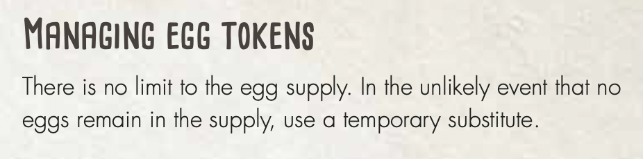
After all the steps the rulebook presents extra details. This one in particular stood out to me because it fills in a gap that is often filled in by “house rules”. Every family has house rules for Monopoly, often filling in gaps (or perceived gaps) in the rules. A classic instance is:
What happens when there are no more houses or hotels?
While it’s not much of a problem to make up a rule to fill in a gap, that rule won’t be play-tested or be consistent with the rest of the rules. Much of the enjoyment of board games (and dislike of Monopoly) comes down to the balance achieved through play-testing, and much of the ease of playing a game comes from the consistency of a single vision of the rules.
In this case, the designers of Wingspan have likely tested the option for capping the number of eggs in the game, and decided that it plays better with no limit. Noting this intention is a nice touch.
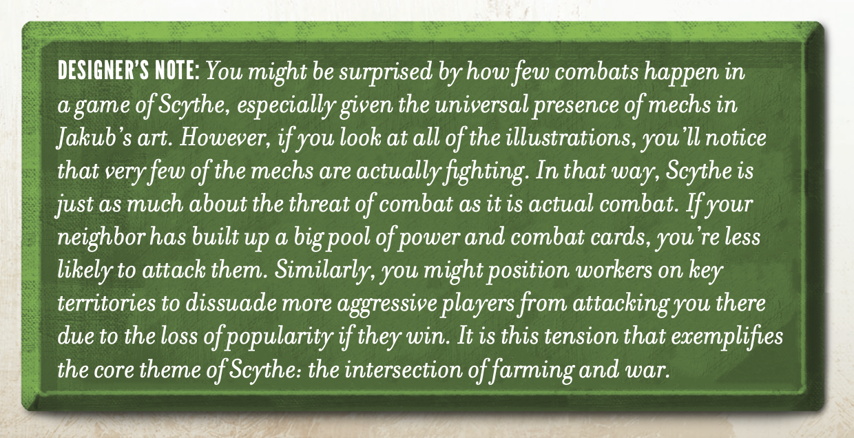
Speaking of the designers, they often crop up in the Wingspan and Scythe rulebooks. I liked this example particularly because it helps to set expectations about how the game plays.
The detail about the threat of combat being as important as actual combat is true in my experience with Scythe, and creates a fun tension when playing, while serving to highlight the immense detriment that combat has on both sides. These designers’ notes are a nice way to express opinion and encourage a certain culture surrounding the games without making those aspects feel like rules to be abided by, and without carrying the mental overhead of something to learn, remember, or read through when looking for that crucial rule check in the midst of battle.
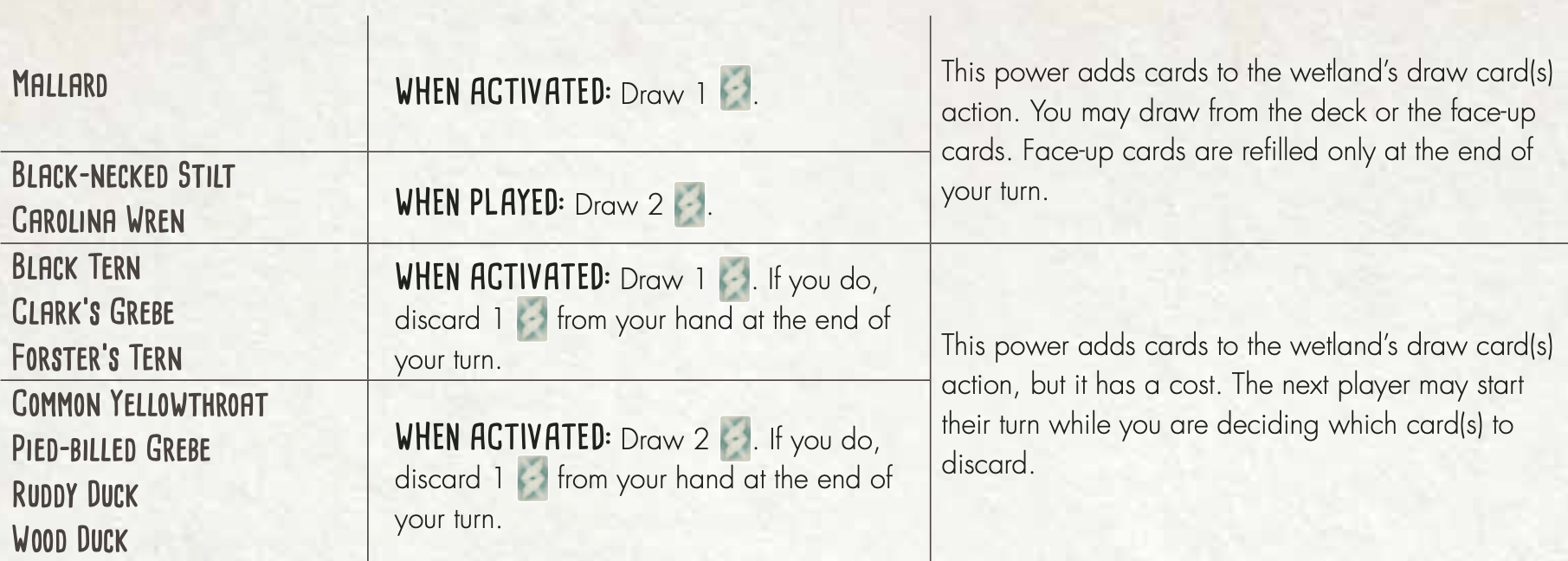
The last detail that stood out in Wingspan’s rulebook was the decision to break some details out in to an appendix. In the game there are 170 bird cards with many different powers. In the same way that clear use of titles, emphasis in text, and diagrams creates progressive information disclosure that makes the rulebook so easy to process, moving the nitty gritty details into an appendix does the same. It’s clear that this is reference material not designed to be learned.
This multi-layered approach to rulebooks – quick-start cards, main rules, detailed reference – is one of the key design details that stands out to me from the rules in these games. This made the process of learning the games much easier for me, but more importantly when I came to share these games with others I had a better understanding of what was important to share and what could wait for later, allowing first-time players to have a much better time than they might otherwise.
Consistent iconography
Another detail that stood out to me was the consistent use of iconography throughout both of these games from Stonemaier. Most games have some sort of iconography but for complex games this becomes more important to convey rules and concepts. What I’ve found different about these two games is how they take iconography further, embedding it in the processes, rulebook, and rule combinations throughout.
Let’s take a look at the resources in Scythe…
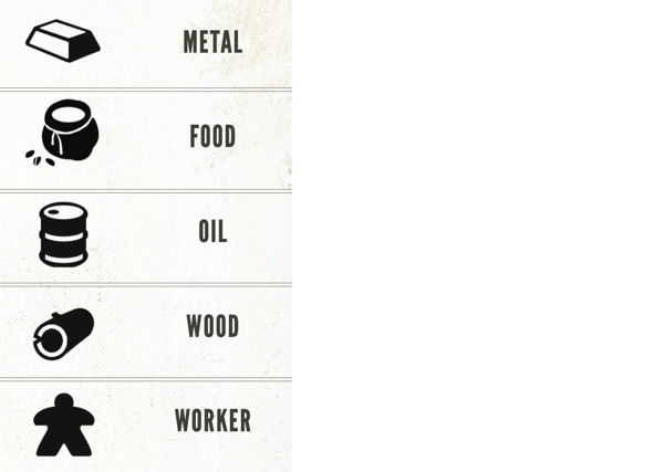
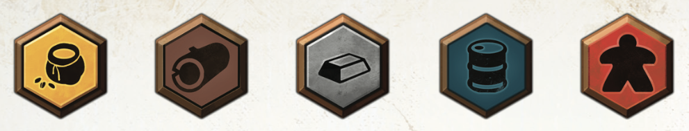
Scythe has 5 core resources that players use in their economies. These are represented by the icons above.
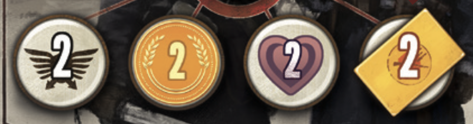
Scythe also has a number of “currencies” – military power, coins, popularity, and combat cards (the context these are being shown in, and the “2” is not important here).
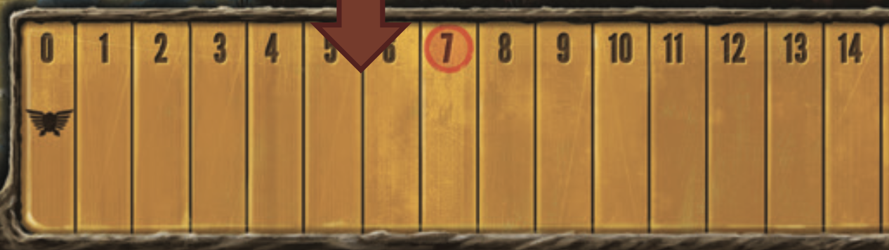
Lastly there are a few other core game mechanics that have icons. The territory tiles that players move about are hexagonal on the board and represented by hexagon ⬡ icons and stars ★ are the end-game mechanic.
Like most board games, Scythe uses these icons on the board to indicate relevance…
Not only are the icons labelling an area of the board, but in many cases they are used next to other icons to show relationships between actions or resources. In this case we can see that having a popularity of 0-3 will get us 3 coins per star ★, 2 coins per territory ⬡, etc.
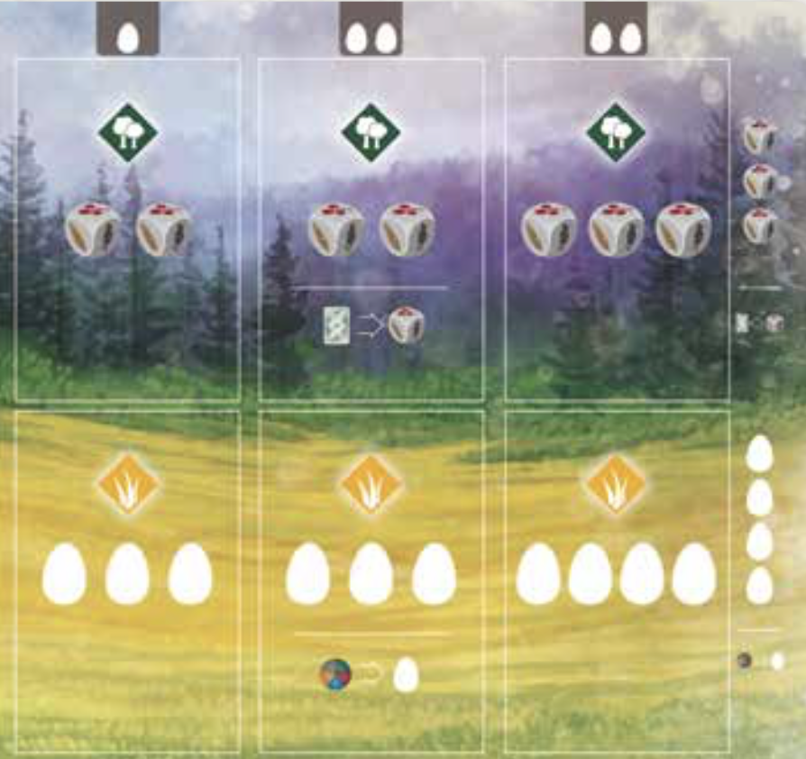
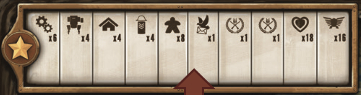
Wingspan also does this, in fact most of the content on the per-player boards are simply combinations of icons explaining what can be done.
![]()
![]()
Wingspan goes a step further and uses its icons in-line in the rulebook, even in the middle of a paragraph in true Tuftian form1.
The next step that Scythe takes however is what I think makes it stand out from most other games, and that’s to combine iconography in systematic ways to build new concepts that are intuitive and don’t need explaining (once the player realises they can trust the icons).
This first example combines the concept of a territory ⬡ and a resource to describe territories that create resources, a key concept in the game.
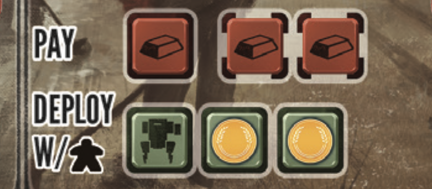
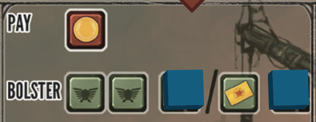
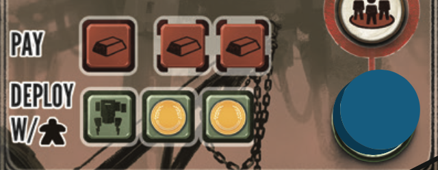
Even more interesting to me is how these combinations form costs and benefits in the game. Since the game is focused around building an economy, a core gameplay mechanic is paying a cost and receiving a benefit. Green and Red (always in these shades) are used to signify these concepts in many places, and combined with other icons to describe complex concepts. Here we can see that when performing this action, the player will…
- Pay 3 metal
- Get a mech (another icon not described above)
- Get 2 coins
- Must deploy that mech where the player has a worker (another new icon)
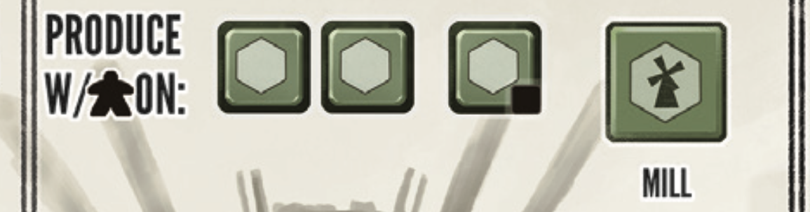
This example shows an even more complex combination – the player can “produce” with 3 workers, on territories ⬡, plus in this case another territory that contains a Mill. It takes a lot of words to describe what can happen here, but the reason why these icons make such a difference is that when playing you can scan the board—worker, territory, mill, benefit—and understand what is represented without having to think through the full details
The only analogy I can draw is that of mathematical notation. We use notation for mathematical concepts because they are abstract and complex, and have very nuanced rules that it’s hard to capture in text. In this way the iconography is a powerful tool for understanding the complex systems of the game, and an aspect of design worthy of appreciation.
Physical checklists
The last aspect that I found to be a genius piece of design in Scythe and Wingspan was the use of tokens to encourage correct processes throughout gameplay. I’ve seen similar concepts before, The Resistance and Secret Hitler both use round markers of various kinds rotating around players to clarify who is in control at any point. This is sometimes useful in as players can get lost in discussion and forget where they are, but in practice their use feels a little contrived most of the time.
Scythe uses tokens to cover certain details on the board and reveal them at a later time. This in itself isn’t groundbreaking, but it’s done in conjunction with the meta rule that anything visible in the game applies, and anything not visible doesn’t apply. Scythe uses this to represent the advancement of players' economies. Over time players upgrade their abilities and in doing so move a token that was previously covering a benefit, to now cover a cost, accelerating the economy.
This ties in beautifully with the consistent cost/benefit process in the game, and means that players have a clear visual representation of what they can do right now, rather than having to combine multiple sources of information to figure out those details.
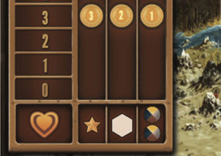
In this example, the player must pay 1 coin for this action and can receive either 2 power or 1 combat card. If they choose to upgrade this action though, they will pick up one of the tokens revealing a further 1 power or combat card.
In performing this upgrade, they will then move that token down the board to cover one of the red costs associated with a related action. The board used for this even has depressed areas to indicate valid placements. The clarity that this design affords the player is great, but it goes further than just easy understanding of the state of the board…
The use of the physical tokens placed in designated spots on the board creates a sort of “physical checklist”. It’s not possible to have a spare token, it’s not possible to accidentally upgrade, and it’s not possible to only partially complete an upgrade.
A more advanced illustration of this is given in Wingspan’s action tokens. The game takes place in rounds, where in each round a player will have multiple turns. Each turn progresses as such…
- The player takes an action token and places it on their player grid, on the row representing the type of move they are taking, and in the left-most empty column.
- They take the resources indicated in the square their action token is in.
- They move the action token left down the row, one square at a time, taking the actions in those squares as well.
- Their token reaches the end of the board and their turn is complete. The token stays on the board.
When the player have no more action tokens left, the round is scored. Each player places an action token on the scoring ladder.
There are a number of neat features about this process:
- At any time the location of the action token tells a player what they need to do next.
- As players build their “engine”2 along the rows, their action tokens have more places to move increasing the velocity of the game.
- As turns are completed, players have fewer action tokens not yet on the board.
- As rounds are completed, players have one less action token each round, shortening rounds that are otherwise becoming more complex and taking longer.
Again there’s a physical checklist, players can’t take too many turns because their turns are physically represented and moved around the board. They are also less likely to forget to take an action because they are moving a token across it.
I’m a big fan of checklists in running processes in the workplace, but in board games the aim is to have fun. Much has also been written about how deliberate physical action helps reduce mistakes. But why do we want a checklist, and why do we need to reduce mistakes in board games?
For me, board games become fun when the practicalities disappear and the focus moves to the player dynamics. If I’m spending time calculating allowed moves instead of being able to clearly see them, or if I’m missing phases of my turn and backtracking or just creating an unbalanced game, then I’m too focused on the practicalities, when I could instead be focusing on enjoying some competition with my friends. A checklist (even if somewhat hidden) helps those practicalities become natural and disappear so that the focus can be on the dynamics.
Wingspan and Scythe are well respected but by no means the best board games on the market. Whether you’re into card games or RPGs, classics or new games, party games or brutal day-long campaigns, there may be better games for you, many of which may feature even better design elements. I focused on these two games because they are games I have enjoyed, and because they made me think about game design in ways I hadn’t thought about it before.
While these design details are quite board game specific, I think there are more general versions that can be applied to the design of a broad range of games, products, processes, and more.
Clear documentation Documentation that has been designed is far better than documentation that has just been written. The Django documentation is a world-class example from the web development world, and the GOV.UK website has many examples of well structured, accessible documentation designed to be usable by almost anyone.
Consistent system design My key takeaway from Scythe’s iconography is the system of notation that it creates. By teaching players basic rules and then recombining those in consistent ways, it creates something that is more than the sum of its parts. This is the power of building systems, rather than everything being an exception.
Making process disappear Lastly, checklists, abstract or otherwise, can help make boring practicalities disappear easy and quick, allowing us to focus on what really matters and where we can add value – whether that value is our expert knowledge in the workplace, or figuring out our friends’ strategies.
Edward Tufte, author of The Visual Display of Quantitative Information, described sparklines – compact data representation, often presented in-line in text or very close to it rather than as separate figures to be referenced. ↩︎
Engine building games are a type of board game. They typically feature a feedback loop that causes action to accelerate throughout gameplay. Players earn resources or abilities, those let them earn more resources even faster. ↩︎